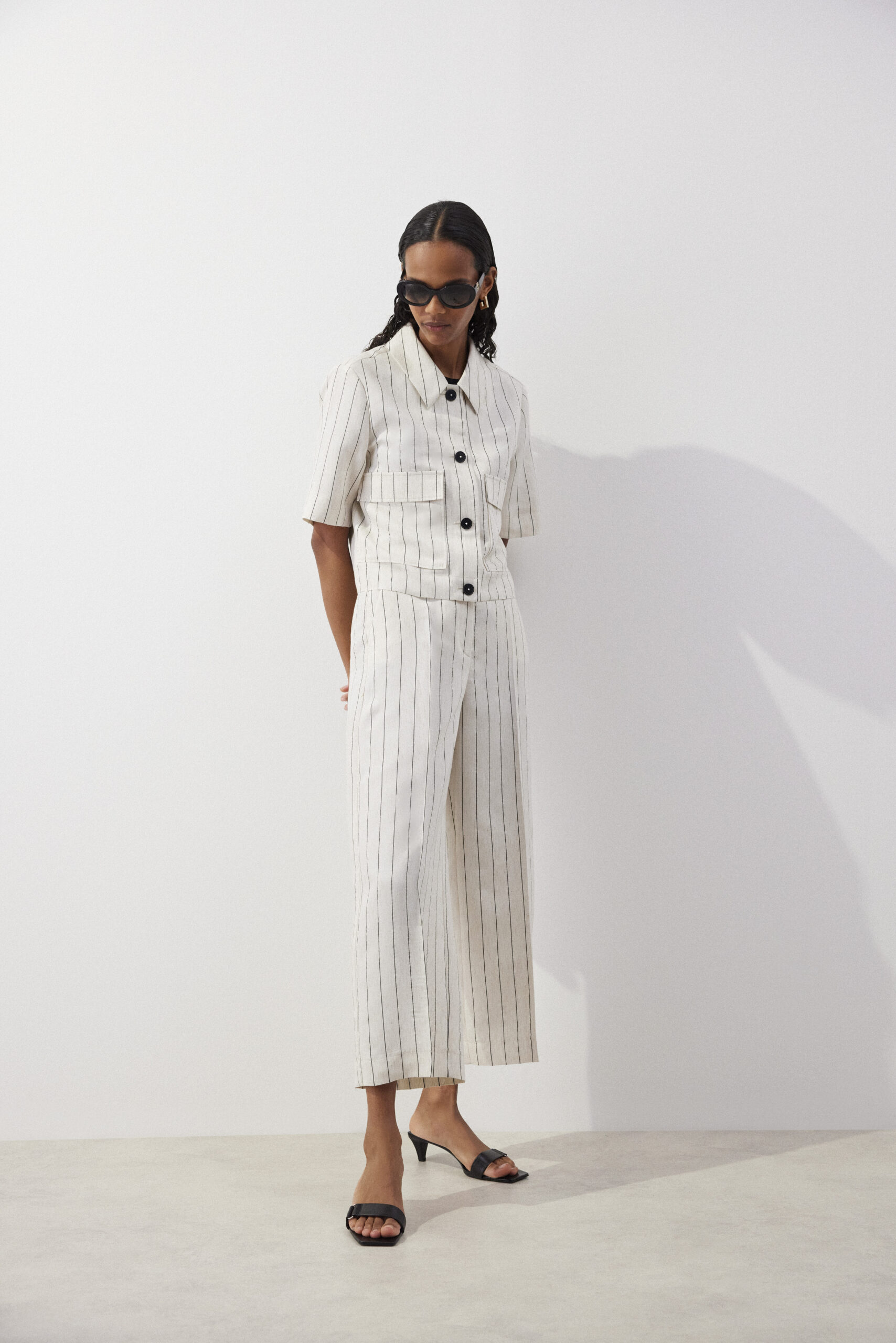
Neutral colors: The silent companion that speaks volumes

Neutral colors are like a quiet companion—never shouting, yet always present. They are subtle, timeless, and irreplaceable in every wardrobe (for women and men alike). While they may seem simple, they are, in fact, quite complex—especially in how we perceive and use them. Most importantly, neutral colors are a rational investment, as they can be effortlessly combined with almost any other shade.
Which Colors Are Neutral?
- White
- Ivory
- Cream
- Sand
- Beige
- Tan
- Khaki
- Olive
- Pewter Gray
- Charcoal Gray
- Navy Blue
- Black
Each has its own undertones—warm or cool, light or dark—and the power of neutrals lies in these nuances. Beige, for example, can be milky soft or sandy and structured. Gray can feel as delicate as mist or as cold as concrete.
 S. Oliver Black Label
What Do Neutral Colors Communicate?
Neutral colors typically convey calmness, composure, professionalism, and refinement. They suggest discretion, maturity, and reliability. In the right tones, they can also appear sophisticated and, at times, mysterious.
Black often signals power, authority, or elegance, though in excess it can feel cold and distant. Beige and cream evoke softness, naturalness, and serenity. Gray often symbolizes balance and neutrality, though without the right pairing it can appear dull.
 S. Oliver Black Label
How to Combine Neutral Colors
The beauty of neutrals is that they can pair with almost anything. However, that doesn’t mean every combination will be visually appealing or harmonious.
Classic Combinations:
- Black + White = timeless elegance
- Gray + Light Pink = soft sophistication
- Beige + Navy Blue = natural contrast
- Taupe + Sage Green = understated elegance
For a More Dynamic Effect:
- Neutrals with a bold color (e.g., Beige + Royal Blue)
- Layered neutrals in varying shades (tone-on-tonelooks—very trendy and elegant)
- Mixing matte and glossy textures (e.g., silk + wool in the same color)
Advantages of Neutral Colors
- Timeless—they never go out of style.
- Versatile—for any occasion.
- Provide the perfect backdrop for statement pieces or accessories.
- In the right tones, they highlight personality without overshadowing it.
Disadvantages of Neutral Colors
- If poorly combined, they can appear dull or lifeless.
- The wrong shade can wash out the complexion or look aging.
- They often require careful fabric selection, as texture greatly affects their impact.
Neutrals in the Psychology of Dressing
In the business world, neutral colors are a powerful communication tool. Gray is often chosen by those who wish to appear impartial and professional. Beige and light gray often appear in environments where calmness is desired (such as healthcare or therapy). Navy blue is associated with trust and stability—no coincidence it’s used in many uniforms.
Neutrals in Business Wear
Neutral colors form the foundation of a professional wardrobe, projecting competence, reliability, and confidence—without unnecessary flash or distraction. They are ideal for work settings where the focus is on expertise, discretion, and structure.
What Each Neutral Says in a Professional Setting:
- Black– Symbolizes power, formality, and authority. Ideal for leadership roles, evening business events, or serious meetings. Can feel distant if not softened with lighter colors or a warm demeanor.
- Navy Blue– Known as the “color of trust.” Perfect for interviews, business meetings, and presentations. Professional yet warmer than black; often perceived as stable and dependable.
- Gray– Represents balance, objectivity, and rationality. True neutrality at its best—mature, but potentially impersonal if not paired well. Light shades are more approachable, dark shades more authoritative.
- Beige, Taupe, Sand– Soft, warm, and approachable; perfect for advisory, educational, or therapeutic roles. Less formal but still elegant. Works well in people-focused environments where trust is key.
- White– Conveys purity, clarity, and precision. In business, most common in shirts and blouses; a clean base for any color combination and a symbol of order.
Why Neutrals Work So Well in Business
- They don’t distract from communication—the focus stays on the person, not the color.
- They radiate professionalism—even without extra accessories or bold details.
- They’re adaptable—easy to style for meetings, events, or dinners.
- They’re a safe choice in conservative industries (law, finance, pharmaceuticals).
 Comma
Comma
Styling Tip for Business Neutrals:
For a more authoritative look, pair navy, black, or charcoal with white or pale blue.
For a more approachable and inclusive feel, opt for lighter beiges, creams, or grays, paired with soft blue, sage, or wine tones.
A quality accessory—like a leather belt, a structured handbag, or a discreet piece of jewelry—can add personality without breaking dress code rules.
Final Thought
Neutral colors in the business world act like a universal language that needs no translation. They allow you to present yourself as someone who knows who they are, what they do, and what they want to say—while leaving room for individuality through details, textures, and tailoring.